We’re spending more time in our homes and paint manufacturers want to make that time as calming and comfortable as possible. The paint trends for 2021 have you in mind, so you can get the most out of every room in your home whether you’re using it for remote work, school, and/or enjoyment. Some of the themes include calmness, flexibility, balance, comfort, and positivity. Say goodbye to beige and gray or greige as I like to call the combination, and hello to a new trend in paint that focuses on staying at home.
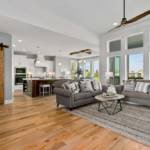
Transform Your Kansas City Home
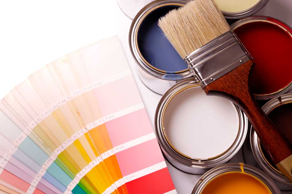
Paint is a cost-effective way to make a small (or big) update to your home. For just a few hundred dollars or less, depending on the size of the room, you can freshen the look of your home and even make it look larger. That’s a lot better financial tradeoff than tearing down a wall! Plus, it doesn’t take long.
Painting also offers protection for interior and exterior surfaces – from wear and tear to protecting walls and trim from moisture. Exterior paint also enhances curb appeal while improving the outlook and positive energy for future homeowners.
My Certified Staging partner, Dee Harding and I, look at a home’s paint when we walk through it before marketing it for sale. It’s one of the best home improvement projects a seller can make to quickly and affordably freshen the look for a potential buyer. This is just one of many tips we provide sellers.
Get our entire guide to selling your home fast!

Paint is the perfect complement to our complimentary home staging service that we offer every seller. Staging sells homes faster and for more money.
2021 Paint Colors
Colors create an atmosphere that affects mood, energy, and disposition. You’ll see that in the 2021 paint colors from the major manufacturers. They’re looking to invoke a mood in 2021 that’s different than 2020. Ready?!
This is a roundup of the Colors of the Year for 2021 from leading paint manufacturers.
Sherwin-Williams
Color of 2021 – SW 7048 Urbane Bronze
Sherwin-Williams chose urbane bronze describing it as “Nature’s ability to cultivate wellness and calm is more welcome than ever. The nurturing hues of this palette, including warm neutrals and natural tones, forge the connection between the modern built environment and the living world.”
The goal is to create a sanctuary at home, that’s simple, and rooted in nature.
The color palettes include:
- Sanctuary – warm neutrals and natural tones
- Encounter – rich but muted tones
- Continuum – white, charcoal, and pops of color
- Tapestry – vibrant with pinks and greens
There are a few grays within each of these color palettes, especially sanctuary. Plus, urbane bronze is a very dark gray. So greige may not be gone just yet!
Inspired by: Wellness + Biophilia, Nesting, Warm Minimalism, Scandinavian Design
Coordinating Colors:
- SW 7006 Extra White
- SW 6127 Ivoire
- SW 7042 Shoji White
So, how do you use this color? Sherwin-Williams suggests you add contrast with wood, with a touch of polished silver or brass, juxtapose with travertine or other pale-tone stones, and textured textiles.
Benjamin Moore
Benjamin Moore 2021 color trends radiate warmth and well-being. These comforting hues are aimed toward nourishing the soul so you can reset and reflect.
The Benjamin Moore Color of the Year 2021 is Aegean Teal 2136-40.
Download the Benjamin Moore 20201 Color Card Brochure
It’s quite a process to pick a color of the year. Learn how Benjamin Moore does it.
Behr
BEHR offers six color themes with a number of paint colors in each palette:
- Casual Comfort – light and warm neutrals
- Subtle Focus – soft and gentle
- Optimistic View – bold
- Quiet Haven – rich colors
- Calm Zone – blues and greens
- Outdoor Escape – easy curbside appeal
Each color theme is versatile in the way of design styles and how each color compliments the other colors so you can use them all interchangeably. There are 21 colors to choose.
“This has been a year of unpredictability and 2020 has significantly changed our relationship with our home. When our color team began exploring a palette for the coming year, we knew it needed to be grounded in what we’ve been craving: comfort and personalization,” said Erika Woelfel, VP of color at Behr. “A new, ‘elevated’ articulation of ‘comfort’ goes beyond traditional beige, gray and green hues, and embraces color in a way that can redefine and enhance any type of space inside or outside the home.”
Valspar
Valspar also chose colors with a focus on coziness and comfort.
This past year has inspired this year’s colors in a positive way. Each hue is intended to nurture the calmness in your life while being flexible with the design elements already in your home.
Their colors of the year bring a sense of well-being to home improvement that in turn fosters a positive mental space.
“Our homes have become offices, entertainment centers and classrooms – which means the colors, sights and sounds in our rooms have an even bigger impact on our daily lives,” said Sue Kim, Valspar color marketing manager. “These lifestyle changes coupled with a surge in DIY home activity helped guide our selection of a range of colors for Valspar’s 2021 Colors of the Year that can not only transform your space but also elevate your mood.”
The Valspar 2021 colors include 12 shades that are sure to match with any current home style:
- Gallery Grey
- Granite Dust
- Maple Leaf
- Soft Candlelight
- Unforgettable
- Arizona Dust
- Cherry Taupe
- Dusty Lavender
- Academy Gray
- Blissful Blue
- Garden Flower
- Lucy Blue
The paint colors are all available at Lowe’s as well as independent paint stores nationwide.
PPG
PPG‘s palette of the year brings warm lightness, a sense of calm, embrace mindfulness, and focus on intention. The colors are easy to use and flexible, made with versatile tones that can be used as either the supporting or dominant color in the room.
- Transcend: A mid-tone oatmeal-colored hue with earthy influences.
- Misty Aqua: Soft, muted, tropical turquoise aqua with an aquamarine undertone.
- Big Cypress: Shaded ginger with persimmon undertones.
The color palette inspires even more combinations.
Be True: vintage-inspired colors
Be Well: comfort and balance
Be Wild: bright and playful
Diamond Vogel
Dreaming of the Day (0470)
Diamond Vogel drew inspiration for Dreaming of the Day by focusing on balance. This soft blue green color suggests a relaxed, meditative feel. Dreaming of the Day matches well with grays, whites, and other neutral earth-tones.
They also have a number of pairings to blend nicely with the 2021 color of the year. View the whole palette.
- Truth Seeker – earth neutrals, warm, and comforting browns with a splash of red
- Beyond – soft blues, saturated greens, deep and comfortable neutrals
- Aware – earthy greens, golds, and yellows
- Reclaiming Yesteryear – eclectic yet classic colors
Picking a paint color
These colors are definitely a contrast to the cool neutrals of the last decade. With some of these trends, we’re seeing calm colors but also rich ones too. The last few years of the decade, we started seeing those bold colors take a front seat. Sherwin-Williams named Cavern Clay and Naval their top picks the last two years.
So, how do you pick your favorite color among all these top choices?
First, think about the mood you want to evoke and how many walls you’re going to paint.
Bright, fun colors can add cheer to any room and have even been shown to enhance the enjoyment of food and cooking.
For perception, white or light paint can enlarge small spaces and make rooms appear larger.
Turn your bedroom into your own escape by painting the walls in soft pastels for a calming effect or go all out and paint your room that bold color you’ve seen somewhere (like your favorite hotel) and fell in love with!
Once you know the mood you want for your room, envision the space with photos of that room. Most of the manufacturers have tools that allow you to virtually paint the walls. Get painting Kansas City! Sherwin-Williams uses ColorSnap(R), PPG’s room visualizer, Envision from Diamond Vogel, and ColorSmart from Behr.
60-30-10 Design Rule
Next, how many walls do you paint?
While many people paint the same color on all the walls in a room, you don’t have to do that. You can also follow the 60-30-10 design rule.
With this design principle, 60% of a room is the dominant color, 30% as the secondary color, and 10% as the accent color. This rule helps determine your color palette for the space you are designing and can lessen the feeling of being overwhelmed when trying to choose paint colors.
Paint is the first step to designing a room, but it doesn’t have to be the last one. Get the latest DIY design inspiration perfect for Kansas City homeowners.
What color is your favorite?


 3751 NE Ralph Powell Road